
The circle is the discipline
A closed geometric system — one grid, one module, one centre. Nothing in the mark is drawn by eye. It is the visual argument for the strategy, the data and the structure behind everything we sign.

The system behind the mark: how it is built, how it is coloured, how it is spaced and where each version belongs. Everything a designer needs to use the brand correctly, and the reasoning that makes each rule non-negotiable.
Let's beginGenius Creative was born on March 8, 2025 around a single conviction: that creativity without measurement is decoration, and measurement without creativity is a spreadsheet. The identity had to hold both ideas at once — and it had to do it in a single shape.
A circle that refuses to close, and a movement that carries it forward.
A closed geometric system — one grid, one module, one centre. Nothing in the mark is drawn by eye. It is the visual argument for the strategy, the data and the structure behind everything we sign.
The ring breaks rather than closing on itself. A brand that closes is finished; ours stays open because every project is an unfinished system that keeps being improved.
Where the circle opens, the form turns outward at exactly 45° and leaves. That vector is the part clients actually hire us for: momentum, direction, and a measurable result at the end of it.
That is the whole brief, and the entire mark is the answer to it. Everything that follows — the geometry, the variations, the palette, the type, the texture — exists to keep that argument legible at any size, in any medium, in any language.
The Genius Creative symbol is a construction, not a drawing. It resolves onto a square field of ten modules, and every radius, thickness and corner in the mark is a whole multiple of one module. Nothing is arbitrary — which is why it can be rebuilt from first principles at any scale.
The symbol sits on a 10u × 10u square. Not a rectangle, not a golden section — a square, because the mark has to read identically as an avatar, a favicon and a two-metre sign.
10u × 10uA single centre point at 5u,5u generates five concentric circles, one module apart. Every curve you will see from here is one of these five — the mark never invents a sixth radius.
r = 1u · 2u · 3u · 4u · 5uThe outer circle at 5u and the next at 4u define the body of the G. The stroke is exactly one module — the same weight that will govern every other line in the identity.
5u → 4u · stroke 1uThe ring is cut and turned inward, terminating on the 3u and 2u circles. This is the counter: the negative space that keeps the G a G and stops the mark from reading as a closed dot at small sizes.
3u → 2uFrom the same centre, a rounded square runs from 3u,3u to the edge of the field, with a 2u corner. A 45° diagonal from the centre cuts it into the forward vector — the movement the whole mark is built to deliver.
3u → 10u · corner 2u · 45°Grid removed, the construction becomes the symbol. Blue carries the structure, green carries the movement, and the two never trade places.
Final constructionOne module — u — is one fifth of the symbol's outer radius. Every measurement in the mark is expressed in u, so the construction survives any resize without a single decimal.
Never redraw, trace or reconstruct the symbol by hand. The master vector is the only source of truth — this page shows how it was made, not a licence to remake it.
The identity ships in a full version and a short version. That is the entire system. Every placement is one of these two — there is no third assembly to reach for and nothing to improvise.
The protection area is the minimum space allowed around the logo. It is measured in X — and X is always half the height of the mark being placed, so the rule reads identically on the full version and on the short one.
X = ½ the height of the mark
Nothing enters the zone: no text, no image edge, no other logo, no crop, no button. Because X is derived from the mark itself, the protection area scales with the logo automatically — it never has to be recalculated.
The chromatic version is the brand. Monochrome exists for the situations where colour is impossible or would fail — never as a stylistic preference. Both variations, full and short, exist in every version below.
Four approved surfaces. On light the mark is chromatic with an Ink logotype; on Blue, on Green and on the gradient the whole mark goes white. There is no fifth surface.
Full version
Chromatic — blue symbol, green movement, Ink logotype.
The whole mark in white.
The whole mark in white.
The whole mark in white, never gradient-filled.
Short version
Chromatic — blue symbol, green movement, Ink logotype.
The whole mark in white.
The whole mark in white.
The whole mark in white, never gradient-filled.
For reproductions that cannot carry colour at all — single-ink print, stamps, engraving, fax-grade documents. One colour across the symbol and the logotype together.
Full version
The whole mark in Ink, for light surfaces.
The whole mark in white, for dark surfaces and photography.
Short version
The whole mark in Ink, for light surfaces.
The whole mark in white, for dark surfaces and photography.
The chromatic version on a dark band uses the white logotype, not the Ink one. Getting this wrong is the single most common way the mark is broken.
A monochrome version tints the symbol and the logotype identically. Keeping the symbol in colour and the words in black is not a monochrome version — it is a broken chromatic one.
Over an image, use the white negative version on a calm, sufficiently dark area. If the area is not dark enough, place the mark on a solid field instead of tinting it.
The palette is deliberately short. Two brand colours carry the meaning, one ink carries the words, and a neutral ladder carries everything else. A short palette is what makes a brand recognisable at a glance.
Primary — structure, strategy, trust
The body of the symbol, primary actions and any moment the brand needs to assert itself. Never on a dark field as text — it drops below contrast.
Secondary — movement, growth, result
The forward vector of the symbol, progress states and confirmations. It is an accent, never a background for body copy.
Typographic — the logotype and the voice
The logotype in the chromatic version, and all headline copy on light surfaces. Warmer and less brutal than pure black, which is why it is never #000000.
Neutral — the page
The default background of the brand. A fraction warm, so the blue reads electric against it rather than clinical.
Contrast is not negotiable. Blue as text belongs on light surfaces only; on dark bands it is replaced by a lightened tint so every combination clears 4.5:1. A brand that cannot be read is not a brand.
Roughly 70% neutral, 20% blue, 10% green. The green never leads — it lands where the eye should end up.
One typeface builds the logotype, one asserts, one explains. Each has a boundary, and the boundaries are what stop the brand from sounding like three different companies.
Headlines above 40px tighten to −0.03em. Untracked display type reads slack and instantly stops looking like us.
Paragraphs never run wider. Beyond that the eye loses the line return and the copy stops being read.
Generous line height in body copy. The brand is confident enough to leave space.
The pattern is not decoration bought from a library — it is the symbol itself, offset and repeated until it becomes a field. It lets the brand fill a space without ever shouting its own logo twice.
The pattern lives at low opacity underneath content. If it competes with what is written on top, it has already failed.
It always runs off the edge of its container. A pattern with visible borders reads as a texture swatch, not as a surface.
Blue on light, white on blue, green on ink. The pattern never carries two brand colours at once — that is the symbol's job, not the texture's.
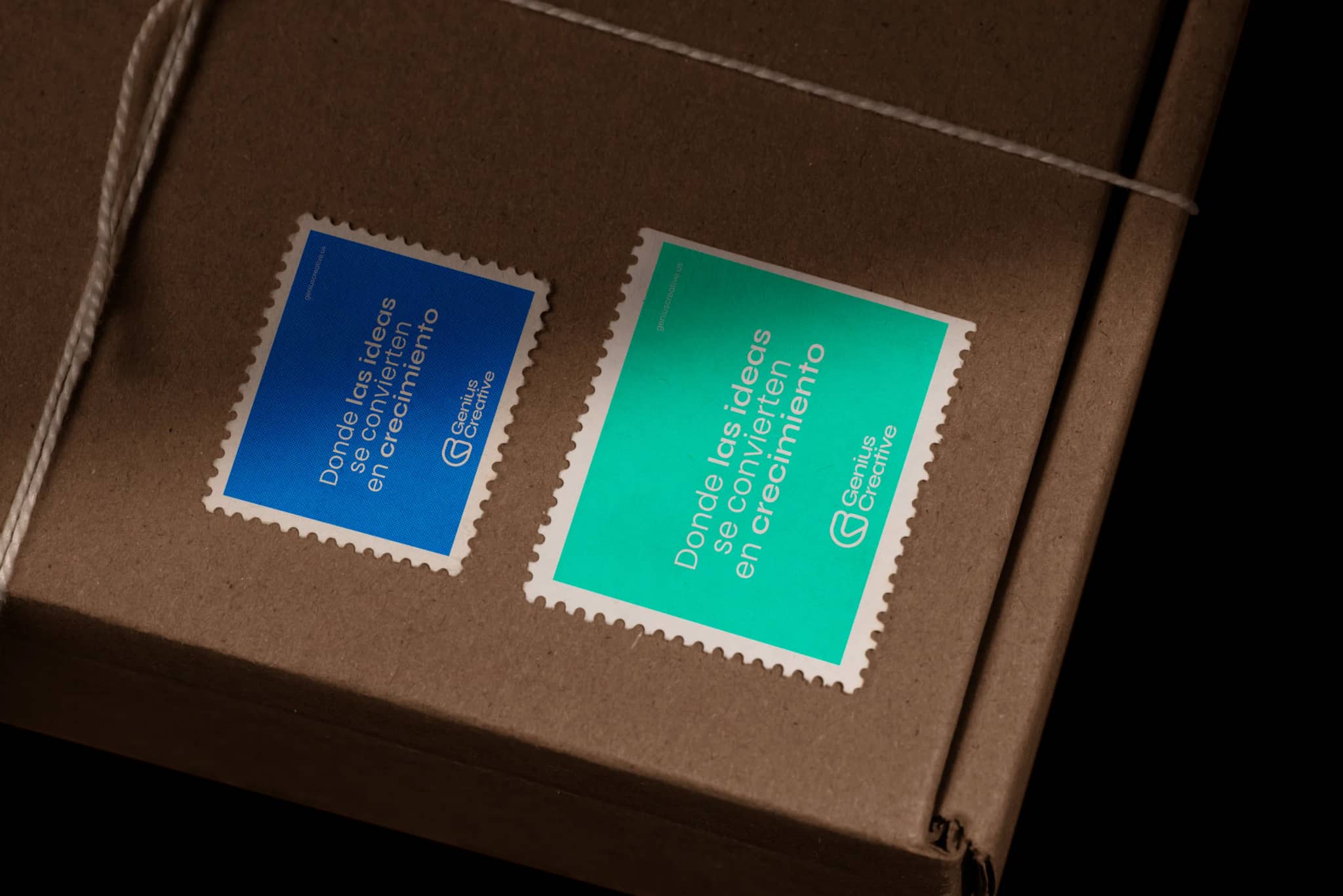
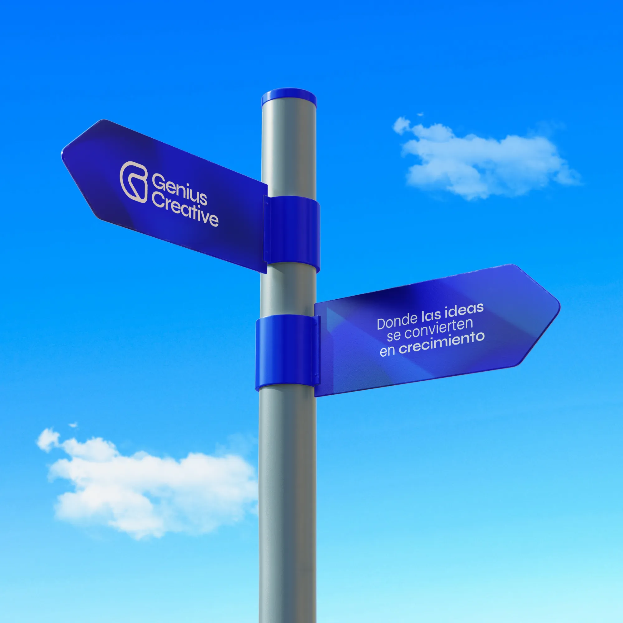
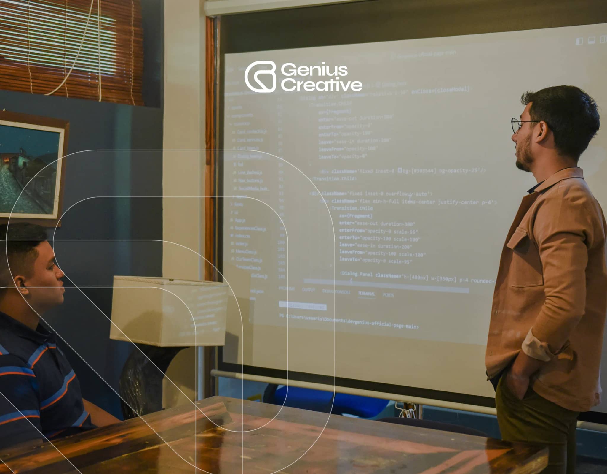
A banner on a lamp post. A lit poster in an underpass, a billboard at dusk, a signpost against the sky. Business cards, packing tape, postage stamps, a screen — and the rooms where the work actually gets made. Different printers, different substrates, different reading distances, and one system holding all of it together.
Most logo damage is not malice — it is a placement made in a hurry. These are the checks that take five seconds and prevent all of it.
Reach for the short version only when the space is square or below the full version's minimum, or when the full version has already appeared on the same surface.
Chromatic on light uses the Ink logotype; chromatic on dark uses the white one. On photography or a busy field, use the white negative version.
One u of clear space on all four sides, taken from the symbol's own construction. Measure it from the mark, not from the container.
Always scale both axes together, always from the vector. The SVG is resolution-independent — there is never a reason to use a raster or to rebuild it.
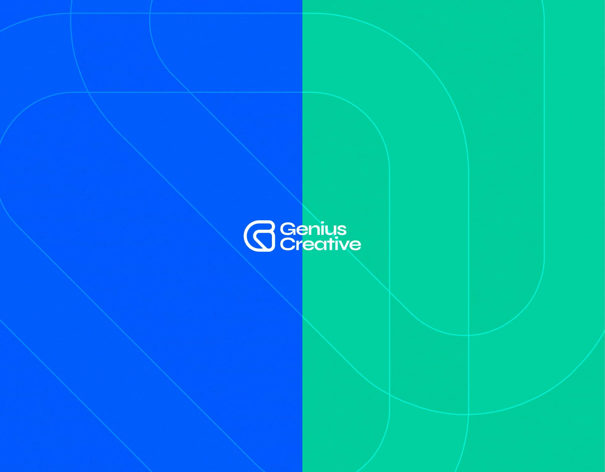
The brand's gradient runs from Blue to Green — the same two values, in the same order the symbol reads them: structure into movement. It is a surface treatment, and it has one rule that matters.
#0061FC → #00D1A4
Every rule below exists because breaking it destroys something specific in the construction — not because of taste.
Blue is the structure and green is the movement. Swapping or re-tinting them into colours outside the palette deletes the entire argument of the symbol.
The gradient is for surfaces. On the mark it melts the boundary between structure and movement, and the two ideas stop being two.
The construction is square and axis-aligned. Stretching it breaks the 1u stroke, and rotating it breaks the 45° vector that gives the mark its direction.
No shadows, no bevels, no outlines, no glows. The mark is flat vector geometry and it stays that way at every size.
One module of clear space on every side, always. A mark pressed against a headline or a photo edge stops reading as a mark.
The symbol and the logotype keep their given distance and alignment. Re-spacing them, stacking them differently or re-typing the words creates a logo that is not ours.
Symbol in colour with the words in black is not a monochrome version. Monochrome means one colour across the whole mark.
On photography the mark needs a calm area or a solid field behind it. If the counter is not clearly visible, the placement is wrong.
A brand manual is not about logos. It is about making sure that every time someone meets Genius Creative, they meet the same company.
Great marketing needs both art and science. Every creative decision is backed by data and designed to convert — the identity included.
Likes and views do not pay the bills. The brand points at the metrics that matter: leads, sales and return.
We act as an extension of the team, not a vendor. The identity is built to sit beside our clients' brands, never on top of them.
Consistency is not a restriction. It is the only reason a brand becomes recognisable.
Ready to start?
Get in touch to explore how we can help your business reach its full potential.
Get Started