


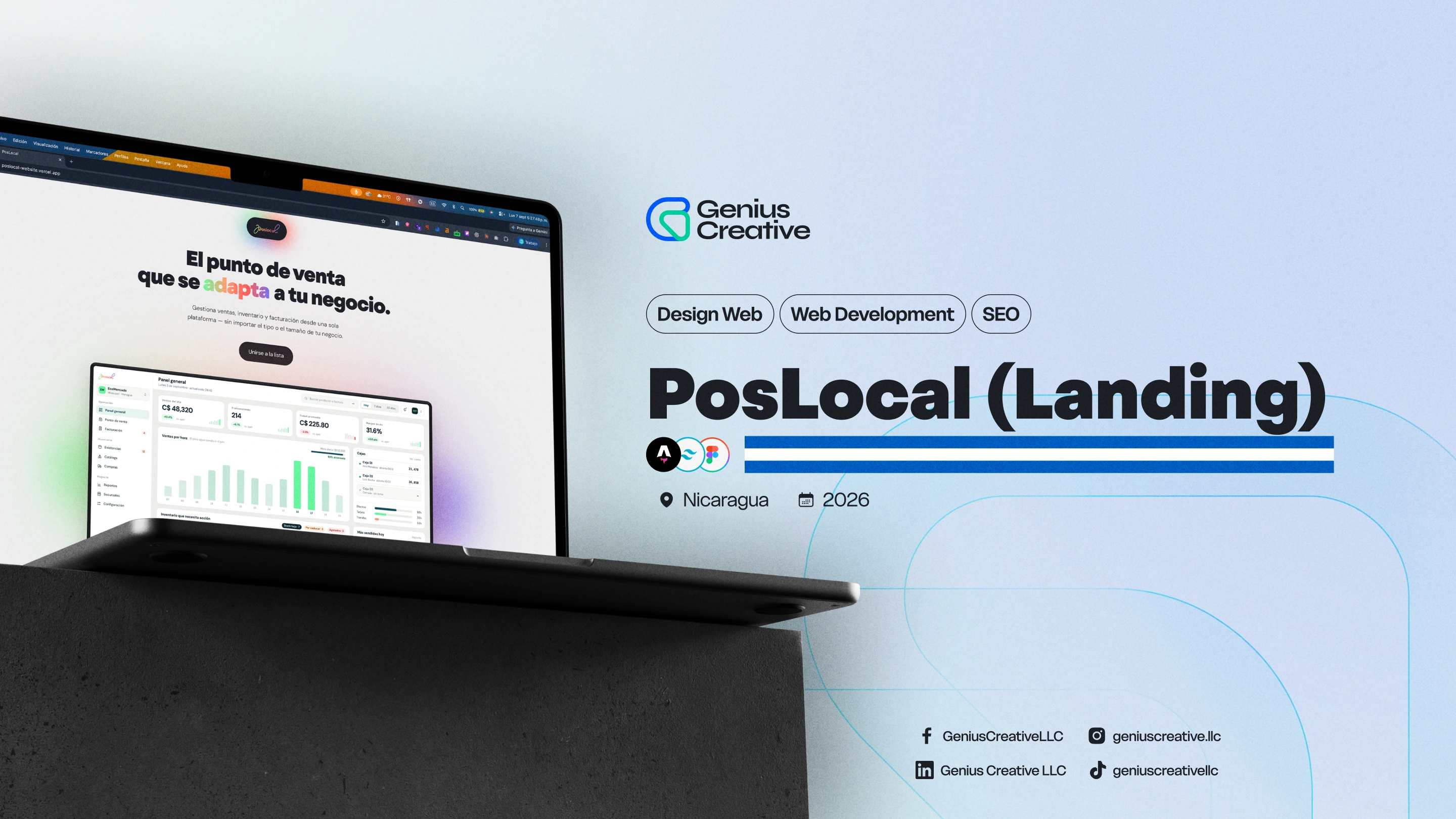
PosLocal — The point of sale that adapts to any local business.
The challenge
PosLocal has to sell software that nobody can try yet. The platform is still in development, so the website carries the entire argument on its own: it has to make an unreleased product feel real, credible and worth an email address, without a demo, a price list, or a single existing customer to point to. The brand did not exist either — no logotype, no color, no voice — in a category where the real alternatives are a paper notebook, a spreadsheet, or an enterprise system far too heavy for a corner store. The positioning raised the bar further: “it adapts to your business” only convinces if the site proves it business by business, so one product story had to hold up for a minimarket scanning thousands of barcodes, a hardware store selling by unit, by meter or by box, a pharmacy tracking expiration lots, and a barbershop paying commission per stylist. And in a pre-launch every visit has to be worth something, because the waitlist is the only conversion available.
The solution
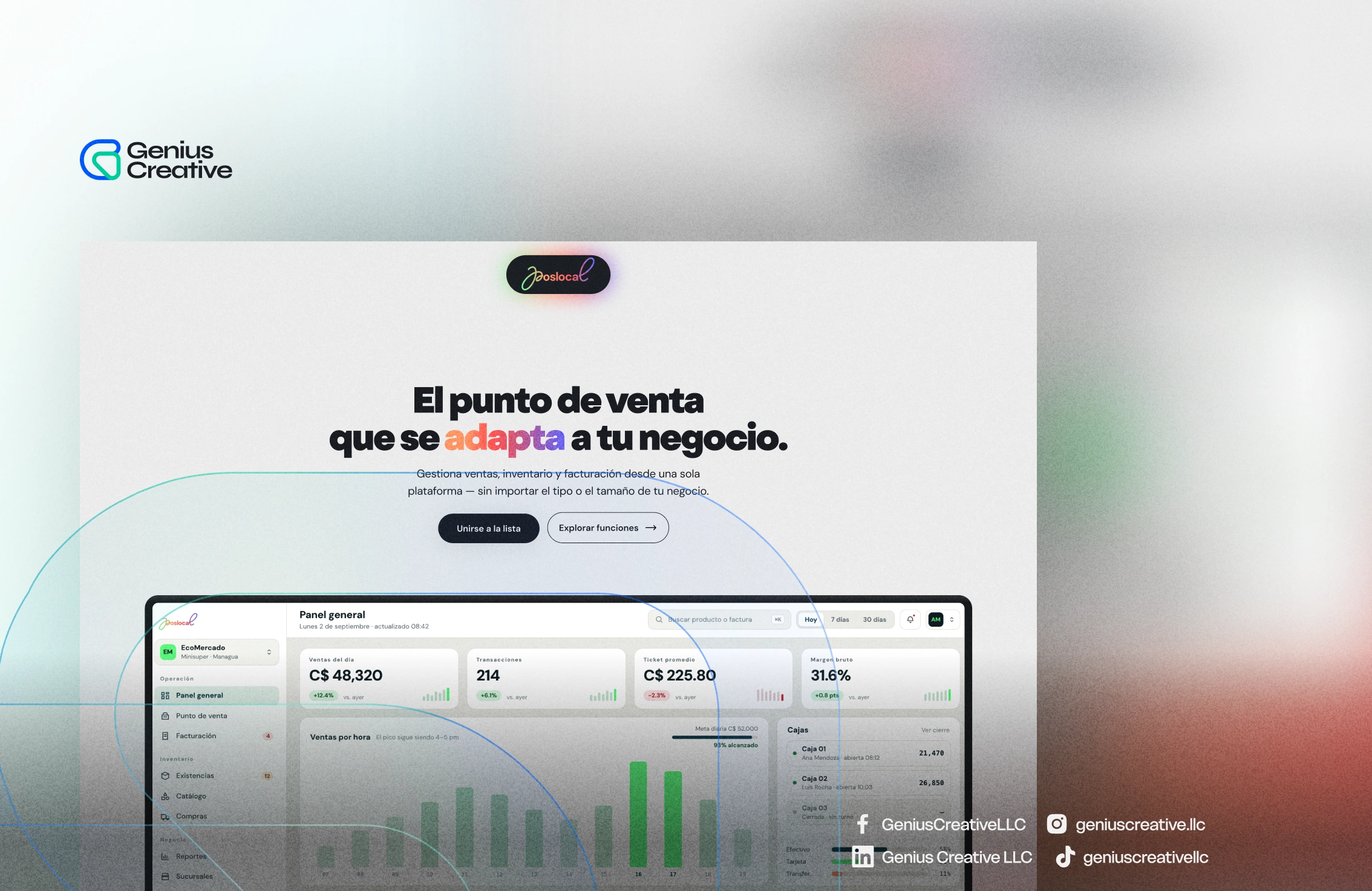
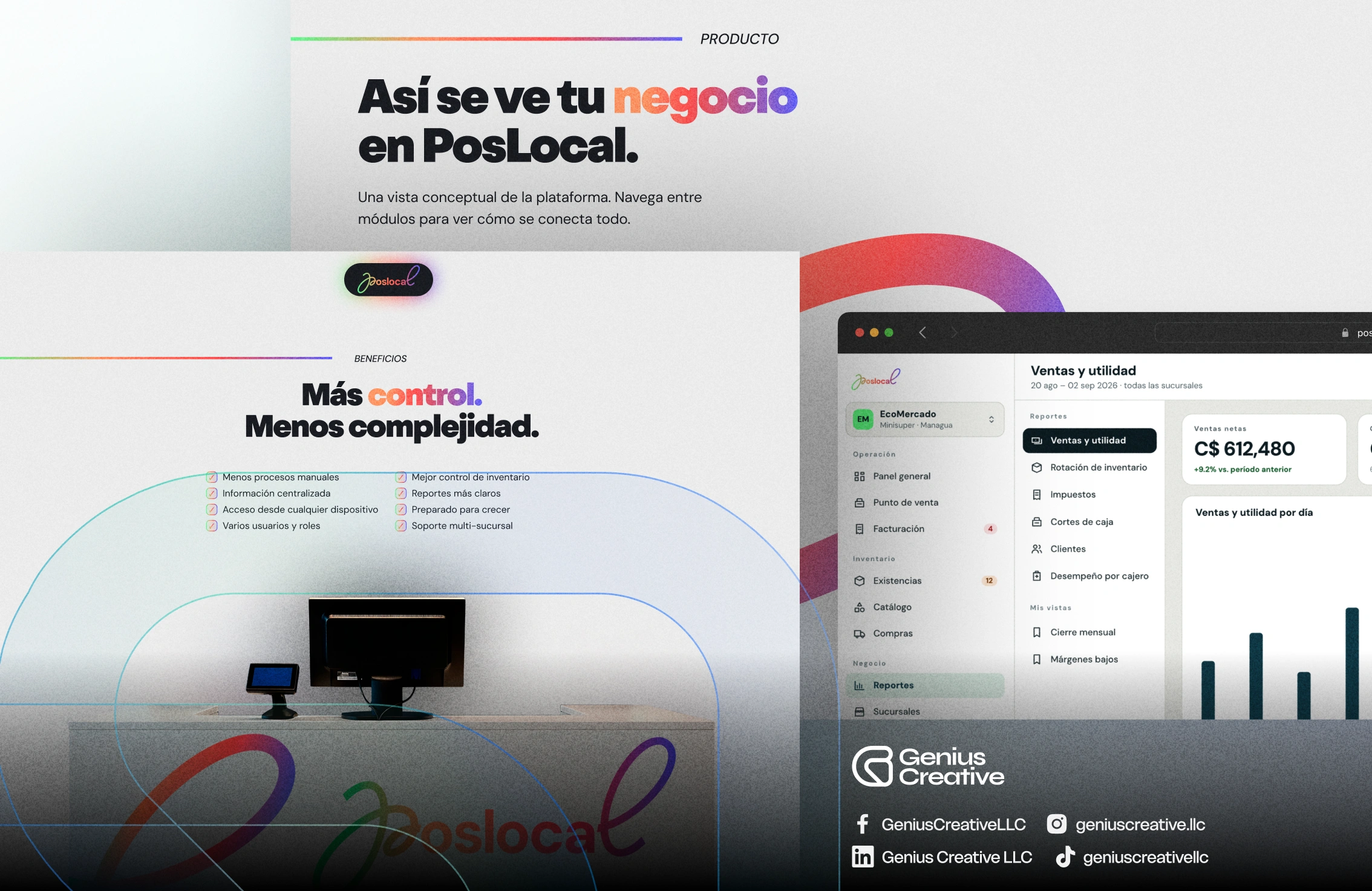
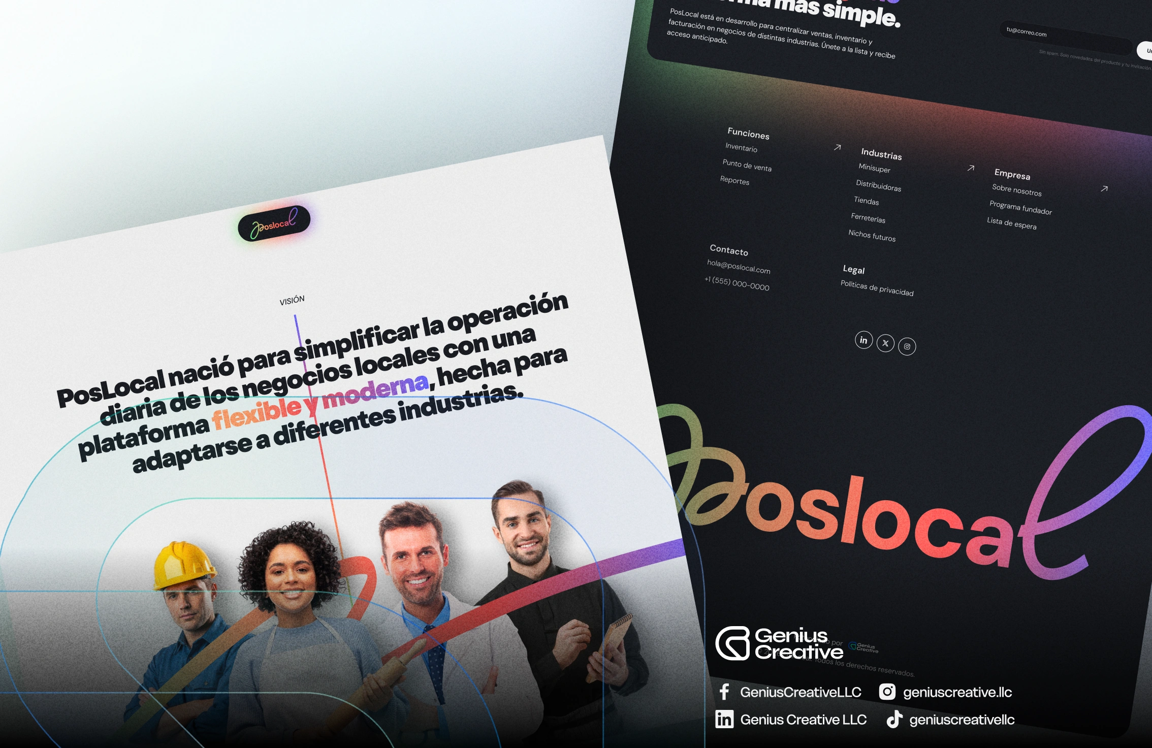
We built the brand from scratch: the PosLocal logotype in a handwritten style set inside a black pill, a spectrum gradient running from orange through red, violet and green as its single signature element, and a type system pairing a heavy grotesque for headlines with DM Sans for the rest — warm and modern, deliberately far from the grey look of enterprise software. To make an unreleased product tangible, we designed the interface itself and placed it at the center of the site: a conceptual tour where visitors move between modules — dashboard, point of sale, billing, stock, catalog, purchases, reports, branches — and see the product working with realistic figures in córdobas, sales by hour, register closings and gross margin. The “adapts to your business” promise is proven structurally, through an industries system grouped into commerce and supply, food and drink, and services and care, with a dedicated page per vertical written in the language of that specific counter. Around it we built the pre-launch engine: the waitlist and the founder program, with early access, locked-in founder pricing and a direct line to the product team, plus company and blog sections that build credibility while the platform matures. Development runs on Astro with self-hosted fonts and a static build for speed, and the SEO strategy follows the same industry architecture so each vertical page can compete for the queries a specific business type searches. Design, development and SEO continue as an ongoing engagement while new modules ship.
Discover other projects
Dive into our diverse collection of innovative projects, where creativity meets cutting-edge technology.
All projects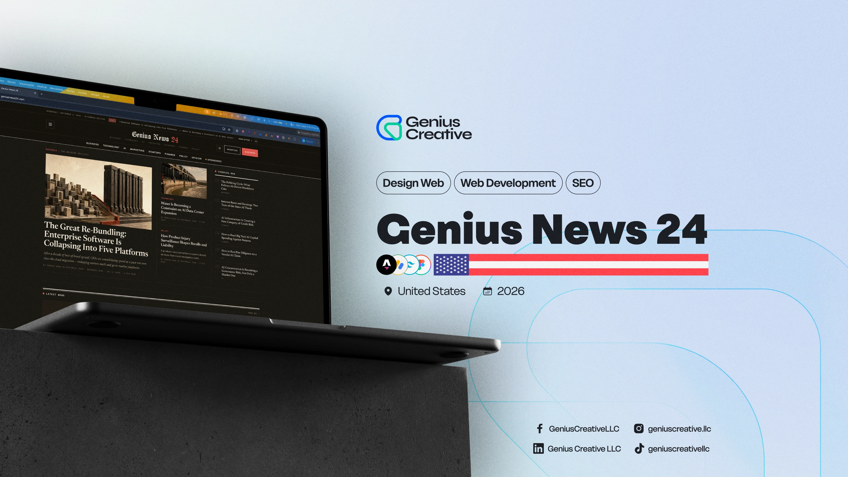
Genius News 24
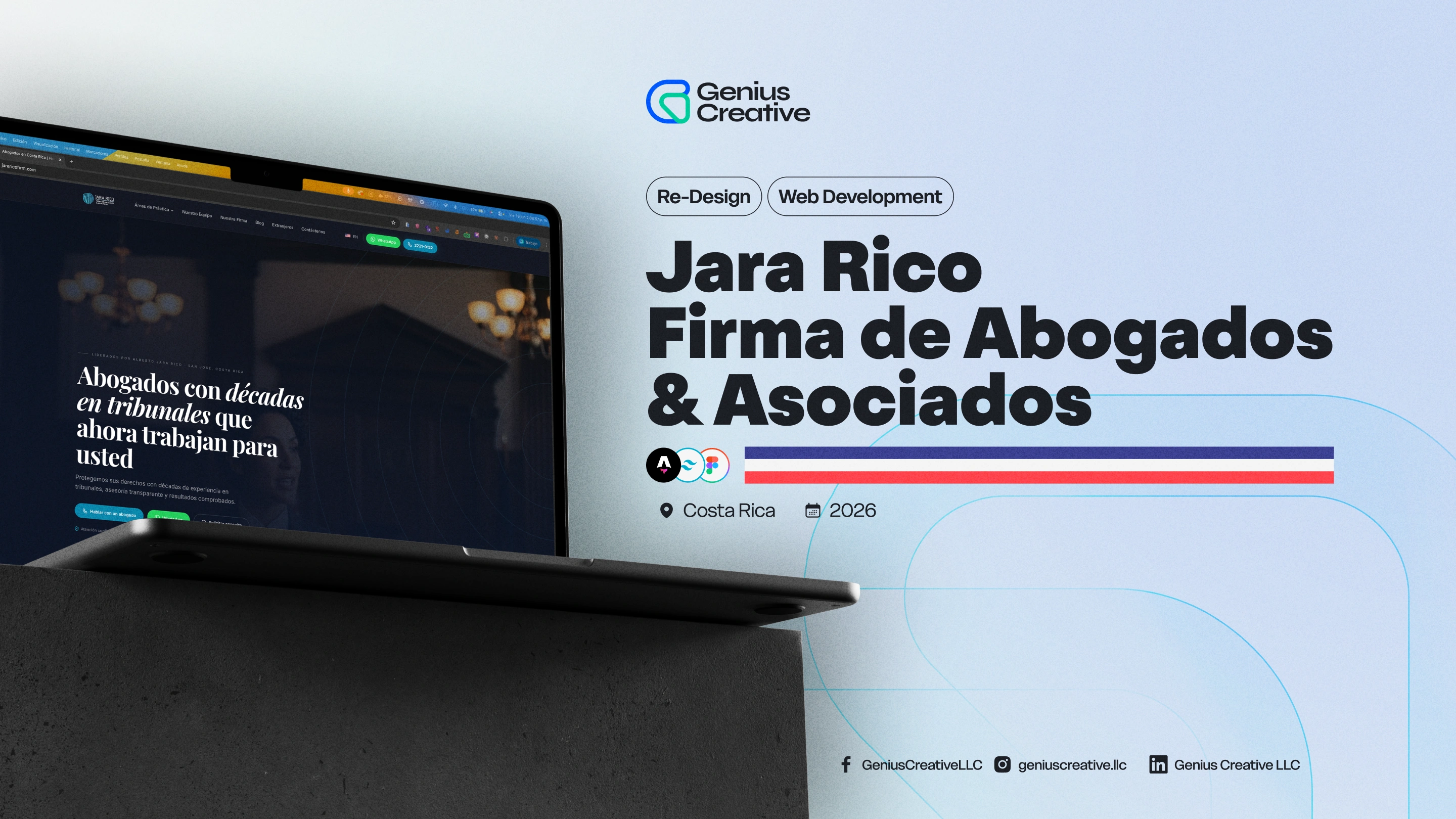
Jara Rico Firma de Abogados & Asociados
Ready to start?
Let's build something great together
Get in touch to explore how we can help your business reach its full potential.
Get Started